Theme's Components
In modern UI development, components are the only blocks we use to build our applications.
Every piece of our UIs is defined by components, from the simple button to the navbar to the page itself.
Components won as a concept because they are the perfect abstraction for reusable UIs: Make one button and use it everywhere you need a button, the same for a card, or a container.
It's basically the Don't Repeat Yourself (DRY) concept applied to visual elements.
Reusable Styles
Sometimes we also want to reuse styles other than components, Morfeo makes it possible with the concept of the Theme's components:
const classes = morfeo.css({
  base: {
    radius: 'm',
    px: 'm',
    py: 's',
    fontSize: 'm',
  },
  filled: {
    bg: 'gray',
    color: 'black',
  },
  outlined: {
    bg: 'transparent',
    border: 'strong',
    borderColor: 'gray.darkest',
  },
});

export function Button({ variant, children }) {
  return <button className={classes('base', variant)}>{children}</button>;
}
We can refactor this component in this way:
const classes = morfeo.css({
  base: {
    componentName: 'Button',
  },
  filled: {
    variant: 'filled',
  },
  outlined: {
    variant: 'outlined',
  },
});

export function Button({ variant, children }) {
  return <div className={classes('base', variant)}>{children}</div>;
}For React users, this can also be simplified further:
export const Button = morfeo.component('Button', {
  variant: props => pros.variant,
});
Read more about morfeo.component API here.
With the Theme's components, you can encapsulate the style of a component and all its variants inside the theme, this way every other component can reuse it or extend it:
const classes = morfeo.css({
  link: {
    componentName: 'Button',
    variant: 'outlined',
  },
});

export function Link() {
  return (
    <a href="/docs" target="_blank" className={classes('link')}>
      Go to the docs
    </a>
  );
}
Define Theme's Components
Basic configuration
A Theme Component, in its more basic form, it's just an object that contains a style:
const theme = {
  components: {
    Button: {
      style: {
        bg: 'primary',
        radius: 'm',
        px: 'm',
        py: 's',
        textAlign: 'center',
      },
    },
  },
};

export const morfeo = createMorfeo({ theme });
Once the style is defined we can use the property componentName in any style to refer to it:
const classes = morfeo.css({
  button: {
    componentName: 'Button',
  },
});
In other words, componentName: "Button" is an alias for:
{
  "bg": "primary",
  "radius": "m",
  "px": "m",
  "py": "s",
  "textAlign": "center"
}
Define variants
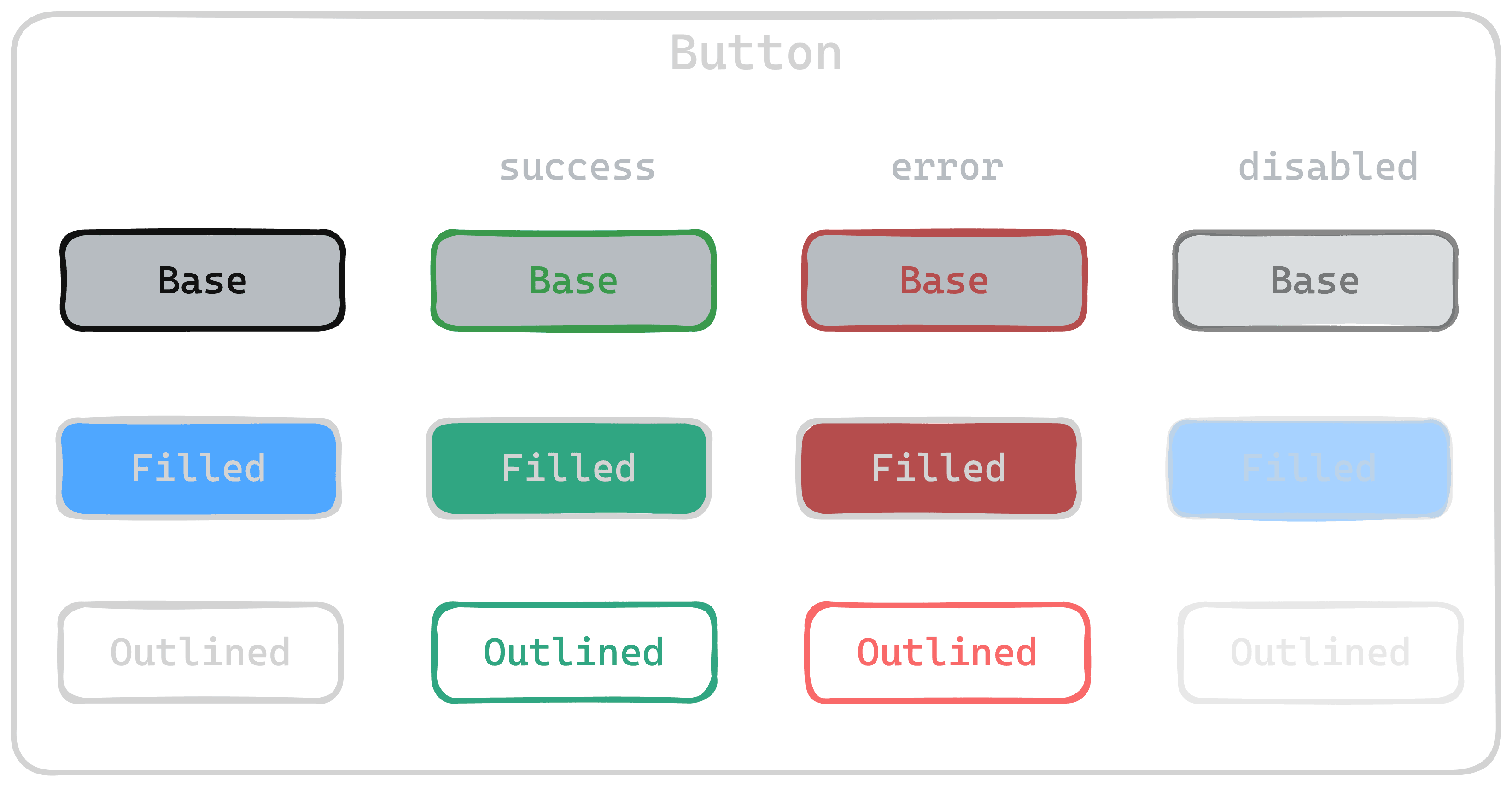
A component usually can be displayed in different ways, for example, a button can be filled by default, or transparent but surrounded with a nice border if outlined.
We call these variations of a base component style variants:
const theme = {
  components: {
    Button: {
      style: {
        // ...
      },
      variants: {
        outlined: {
          style: {
            bg: 'transparent',
            border: 'strong',
            color: {
              light: 'gray.darkest',
              dark: 'white',
            },
            borderColor: {
              light: 'gray.darkest',
              dark: 'white',
            },
          },
        },
      },
    },
  },
};

export const morfeo = createMorfeo({ theme });
Once the variant is defined we can use the property variant combined with componentName in any style to refer to it:
const classes = morfeo.css({
  button: {
    componentName: 'Button',
    variant: 'outlined',
  },
});
When the variant is specified, the base style of the component is merged with the style of the variant, variant's style overrides the base style in case of conflicts.
Define states
Component style is defined by 3 things:
- The
basestyle - A specialization of the base aka
variant - The
stateof the component
Let's stick to the Button component example, we might want to define the styles of the button in case it's disabled:
const theme = {
  components: {
    Button: {
      style: {
        // ...
      },
      variants: {
        // ...
      },
      states: {
        disabled: {
          opacity: 'light',
          cursor: 'not-allowed',
        },
      },
    },
  },
};

export const morfeo = createMorfeo({ theme });
Once the states are defined we can use the property state combined with componentName (and also variant) in any style to refer to it:
const classes = morfeo.css({
  button: {
    componentName: 'Button',
    variant: 'outlined',
    '&:disabled': {
      state: 'disabled',
    },
  },
});
For React users
If you're using React, you can use the API morfeo.component which gives you another set of functionalities.
Define element tag
const theme = {
  components: {
    Button: {
      tag: 'button',
      style: {
        // ...
      },
      variants: {
        // ...
      },
      states: {
        // ..
      },
    },
  },
};

export const morfeo = createMorfeo({ theme });
Variants overrides
Variants can also redefine the tag in case is needed:
const theme = {
  Typography: {
    tag: 'p',
    style: {},
    variants: {
      title: {
        tag: 'h1',
        style: {},
      },
      subtitle: {
        tag: 'h2',
        style: {},
      },
    },
  },
};
Define initial props
const theme = {
  components: {
    Button: {
      tag: 'button',
      props: {
        type: 'button',
        'data-testid': 'morfeo-button',
      },
      style: {
        // ...
      },
      variants: {
        // ...
      },
      states: {
        // ..
      },
    },
  },
};

export const morfeo = createMorfeo({ theme });
Variants overrides
Variants can also redefine props in case is needed:
const theme = {
  Typography: {
    tag: 'p',
    style: {},
    props: {
      'data-testid': 'morfeo-paragraph',
    },
    variants: {
      title: {
        tag: 'h1',
        style: {},
        props: {
          'data-testid': 'morfeo-title',
        },
      },
      subtitle: {
        tag: 'h2',
        style: {},
        props: {
          'data-testid': 'morfeo-subtitle',
        },
      },
    },
  },
};